Colour is an incredibly powerful non-verbal communication tool which can have a dramatic effect on our mood and performance. Whilst some hues may subconsciously boost our wellbeing and improve our productivity, others can provoke stress or anger.
So profound is the effect, colour can even induce physiological changes such as raised blood pressure and eyestrain. As artist Pablo Picasso so aptly put it: ‘Colours, like features, follow the changes of the emotions.’
So, when designing an office space, selecting a carefully-curated colour palette is crucial to maximise employee wellbeing and productivity. But where do you start?
Colour psychology is becoming a crucial tool for designers when planning office spaces. Indeed, Karen Haller, a Behavioural Design Consultant, has written a designer’s bible, The Little Book of Colour, explaining how understanding colour can literally transform your life.
Colour psychology helps us to understand how various colours trigger different emotions, moods and reactions, with colours divided into two primary categories; warm and cool. Warm shades such as orange, red and yellow are associated with activity, energy and excitement, whilst cool colours such as blue, green and purple are linked to calmness, serenity and focus. Once you’ve grasped these principles, you can create the optimum colour scheme for your workplace.
It’s worth remembering that some colours have cultural connotations and symbolic meanings, whilst others can have a significant impact on an increasingly neurodivergent workforce. Yellow and red can be overstimulating for those with autistic spectrum disorder, for example, but beige, greys, cream and tan generally have a calming effect.
Finally, consider which colours might work for different spaces depending on the type of feelings you’d like to evoke. A calm zone designed for relaxation may benefit from a different colour to a creative space where collaborative thinking is key. Crack this and your office design can promote happy, contented and energised employees.
“Colour can change emotions and I love that as designers we can utilise these in our interiors to create rooms for different uses. We can also be playful in incorporating client colours into spaces. Whether this is in details in floor tiles or wallpaper, or hints of colour within a chair detail – it doesn’t always have to be obvious. Subtle can be clever and create interest!”
Design team, COEL
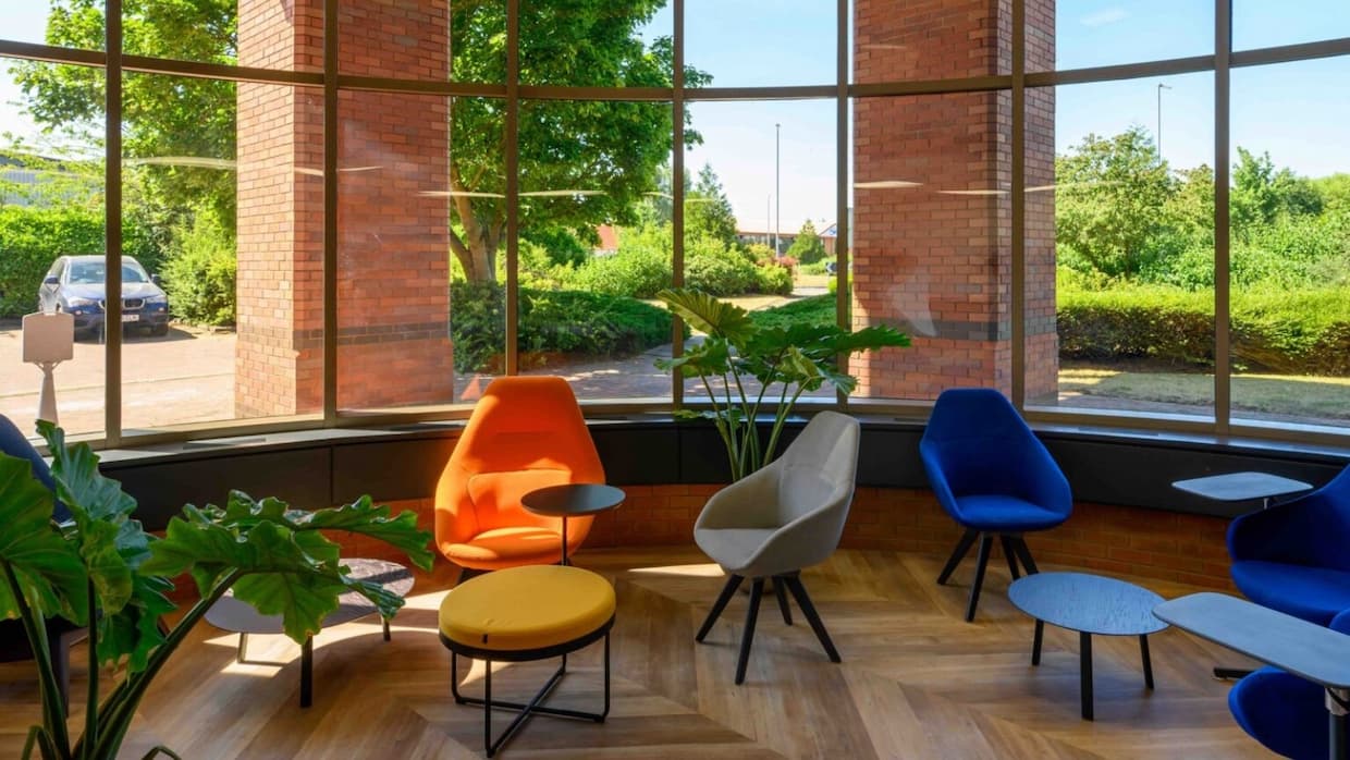
Considered the most productive of colours, blue is incredibly calming. Makes sense really when you recall how relaxing it feels to be standing in front of a sparkling azure sea, with a cloudless blue sky above you!
Blue is also associated with stability, trust and harmony, and is even considered an appetite suppressant. Here’s how to utilise it in your office design:
In COEL’s design and fit out of a new office and marking suite for Biomed Realty the brand’s corporate colour, a deep Klein blue, was featured throughout. From a luxurious blue corner sofa, to blue statement walls, the iconic colour provides visual impact and tempers natural light levels.
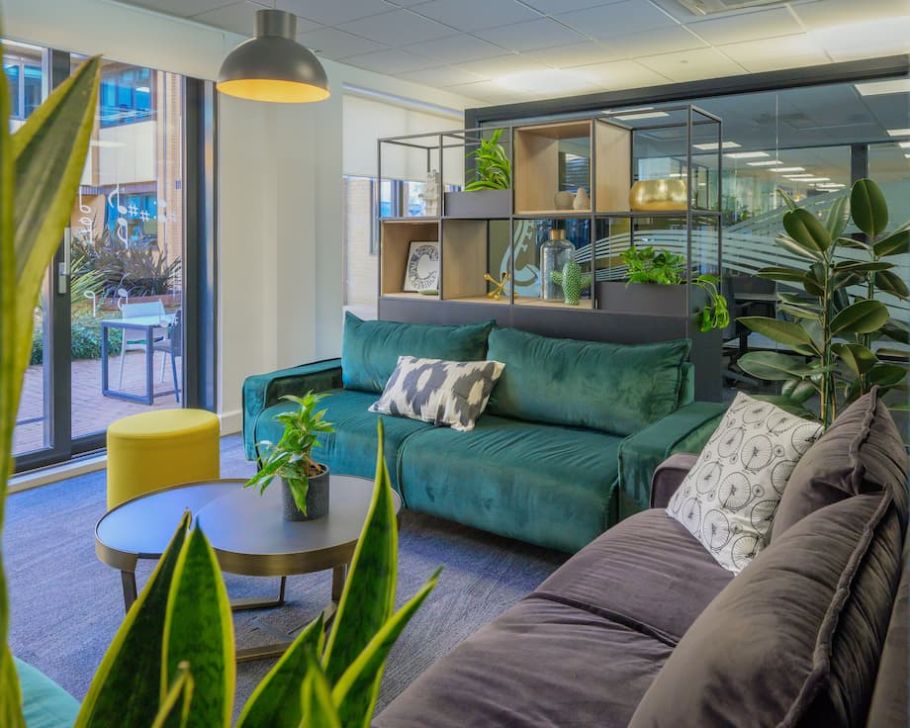
The very colour of nature and new growth, green makes us feel connected to the great outdoors, and consequently at peace. Like blue, it’s calming so helps to relieve stress and create a serene and tranquil environment. A soothing colour, it won’t cause eye discomfort, and will help employees to feel balanced in mind, body and emotions. Here’s how to use it:
Lush shades of green were prominent in the design of a new workspace for GW Pharmaceuticals, now part of Jazz Pharmaceuticals in Cambridge. Moss panelling and jade green bar stools featured in the inviting kitchen area, whilst a myriad of biophilic elements, including trailing greenery over a table gantry, provided an uplifting environment connected to nature.
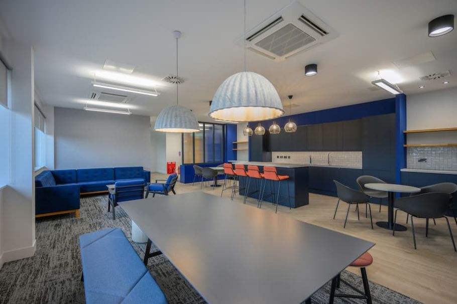
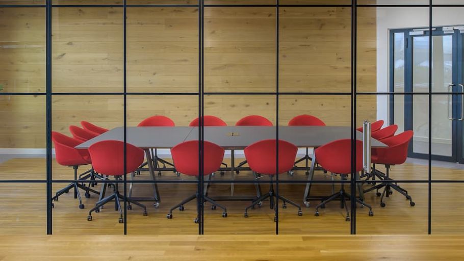
Considered the most stimulating shade in the kaleidoscope of colours, red creates excitement and can even increase the heart rate, blood flow, respiration, brain wave activity, and appetite. Linked to strength and power, red can energise, boost confidence and make you feel that little bit braver. Some cultures view red as ‘lucky’.
Here’s how to use it:
“Our team have a natural affinity with colour and we are always looking for alternative ways to integrate it within our interiors. Colour has the power to transform spaces, whether through subtle neutral tones embodying a calming emotion or through the opposite, bright bold impactful palettes for instilling a fun energetic vibe.
“The story of our colour palettes start with the combination of architecture, our client’s company culture, brand identity and desired aesthetic – the result is a space where colour blends seamlessly within the built environment.”
Design team, COEL
When curating furniture for renowned food manufacturer McCormick & Co in Peterborough, COEL incorporated vibrant scarlet chairs in the main boardroom, igniting the space and making it perfect for focused discussion. In other less formal areas, office furniture in zesty shades of lemon, orange and lime created a refreshing contrast.
Welcome to the wonder colour! Feel-good yellow gives you a sunny disposition, encouraging positive thinking and optimism. Able to heal the nervous system, relieve depression and help deal with unresolved feelings, yellow makes you feel warm, energised and firing on all cylinders in terms of creative thinking. Be aware though, that it can be considered a sign of danger or deceit. Here’s how to utilise it:
Pops of sunshine yellow illuminated COEL’s design of award-winning digital agency, Crafted, in Ipswich. Vibrant yellow cushioned panels were set amidst contrasting grey cushioned panels on tiered bleacher seating, to create an uplifting breakout space, conducive to collaboration. Yellow bar stools added a cheery element to the relaxation area.
Bright and vivacious, orange is happy, warm, uplifting and attention-grabbing. A mentally-stimulating colour, it’s associated with increased energy levels, enthusiasm and a loss of inhibitions (good to have near when you’ve got a nerve-wracking TED Talk to do?).
Orange is used to alleviate fatigue and treat depression, and is said to aid the assimilation of new ideas. A good all-rounder maybe? Let’s take a look:
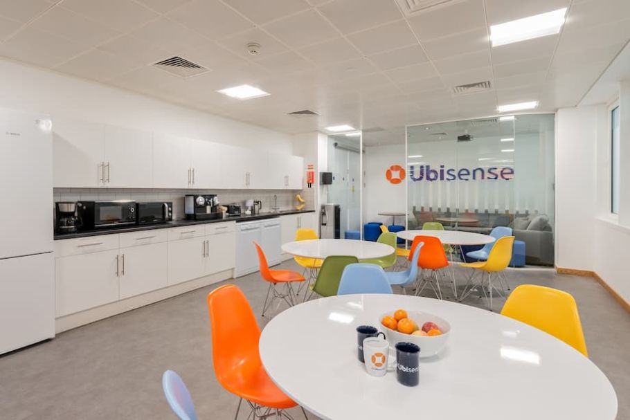
From cushions and contemporary furniture to illuminated wall panels, vibrant orange was woven throughout COEL’s smart, contemporary workplace design for Ubisense in Cambridge. Orange and blue, which reflect the Ubisense branding colours, were used to create a variety of formal and informal meeting spaces, quiet work areas, breakout spaces and a coffee shop-style zone to encourage brainstorming sessions.
We have a bit of a dopamine-inducer here, with soothing pink known to have something of a tranquilising effect (especially on aggressive behaviour). It also helps treat anxiety and can be emasculating. Fancy a ‘pretty in pink’ office design? Here’s how:
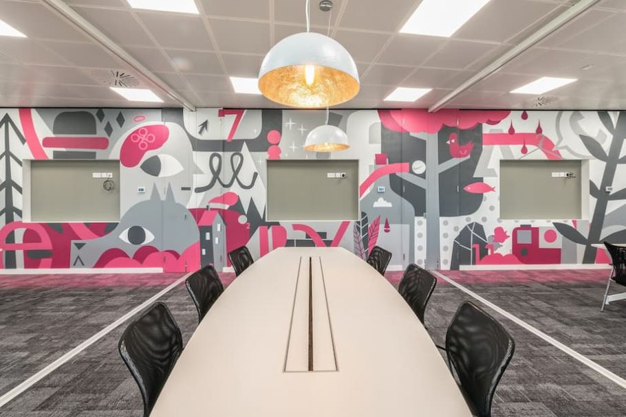
Bold pinks created wow-factor for employees and visitors alike in the design-led interiors of young, fast-growing company Stobbs. With the monochrome background of Stobbs’ branding providing a neutral backdrop, splashes of pink in the quirky graffiti wall artwork, inside booths and in carpets added a dynamic feel to the office and breakout spaces.
Traditionally associated with royalty, power and wisdom, yet with the ability to calm the mind and nerves, purple is a delightfully versatile colour. This regal number can be used to create a peaceful nurturing environment, to treat insomnia and compulsive behaviour. Deep purple can be associated with sophistication and luxury so can be a reflection of a prestigious brand. Here’s some ideas for inclusion:
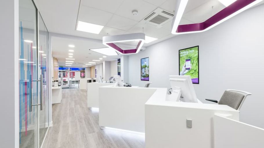
Accents of violet and purple were peppered into COEL’s fit out Cambridge Building Society’s flagship store in St Andrew’s Street, Cambridge. Regal purple lined the interior of contemporary suspended lights, whilst a violet and blue artwork design featured on glass partitions, to create a bright and welcoming environment for customers and employees.
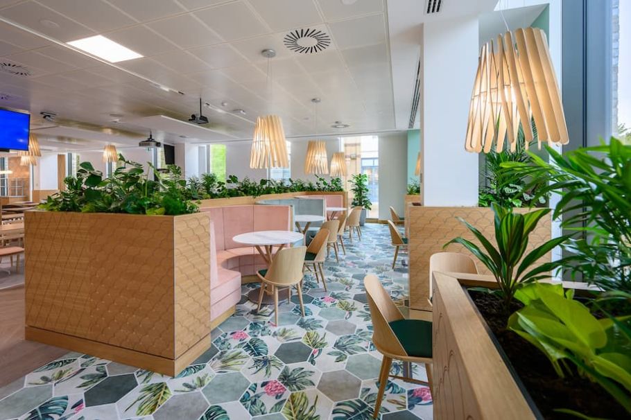
Though not the most vibrant shades, browns and beiges promote feelings of strength and resilience, dependability and safety. They remind us of our connection to nature, helping us to feel grounded and down to earth, so certainly have their place in office design. This is how:
Earthy browns and wood accents were included throughout COEL’s fit out at Cambridge Science Park. Interior design features – including wooden booths – gave a nod to nature and the great outdoors, and created the ideal area for staff to interact, collaborate, socialise or simply be alone. Colour, texture, and detail combined to forge a tranquil ambience.
Understanding colour psychology is key to generating engaging, uplifting and productive office design, especially in the post-pandemic era, where employers need to entice staff out of the WFH bubble and back into the workplace. By carefully curating your colour palette, you can devise an office environment which is happy and energised, promotes wellbeing and fosters a positive work culture.
“Designers are like a white canvas and with their creative minds can always create a unique space, based on a received brief. As a project team, we sometimes encourage our clients to be brave with selecting the colour palette.”
Design team, COEL
Our commercial designers at COEL are passionate about colour psychology, so why not get in touch to see how we can transform your workspace with the addition of amazing colour?
Prefer an AI Summary?